
Data & Analytics
Data Analytics Hub
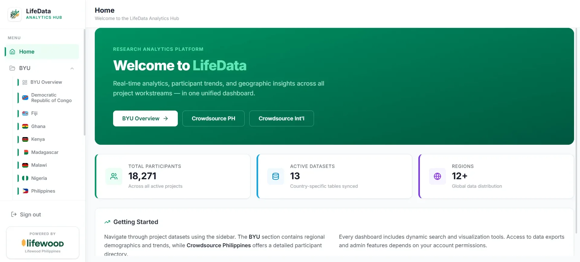
A unified analytics platform that pulls scattered project data from multiple countries into one live dashboard, reconciling inconsistent field names along the way.
Year
2025
Role
Full-stack Developer
Client
Lifewood Data Technology
Stack
React 18, Vite, Supabase (PostgreSQL), Tailwind CSS, Recharts
Internal Lifewood dashboard, no public demo.
01
The problem
Lifewood runs projects across many countries (the Philippines, Kenya, Malawi, DRC, Ghana and more), and every region tracked its data differently. The same field might be called "Student ID" in one place and "Student Number" or "Pathway" in another. Stakeholders had no single view, so getting a clear picture of headcounts, demographics or growth meant digging through separate tables by hand. They needed one place to see everything, updated live.
02
What I built
LifeData brings all of those sources into one dashboard. It reads each region's data, reconciles the differences automatically, and turns it into demographics and trends you can read at a glance.
What made the data trustworthy
Automatic data normalisation
The system merges naming variations like "Student ID" and "Pathway" into one reliable metric, so messy international data still lines up correctly.
Real-time sync
A direct Supabase connection means numbers update within seconds, so stakeholders see current figures instead of stale exports.
Readable visuals
Custom area charts and demographic breakdowns (age averages, gender split, affiliations) turn raw rows into something anyone can act on.
React and Vite power the app, Supabase handles the live PostgreSQL backend, Recharts draws the trend and demographic visuals, and Tailwind with a custom "Aurora Glass" design system keeps the interface clean.
03
What I learned
The hardest part of analytics is not the charts, it is the messy data underneath. I learned to design around real-world inconsistency instead of assuming clean inputs, and to treat normalisation as a core feature rather than an afterthought. If I revisited it, I'd add user-defined field mapping so a new region could be onboarded without touching code.