
Web Apps
Sherlyn Portfolio
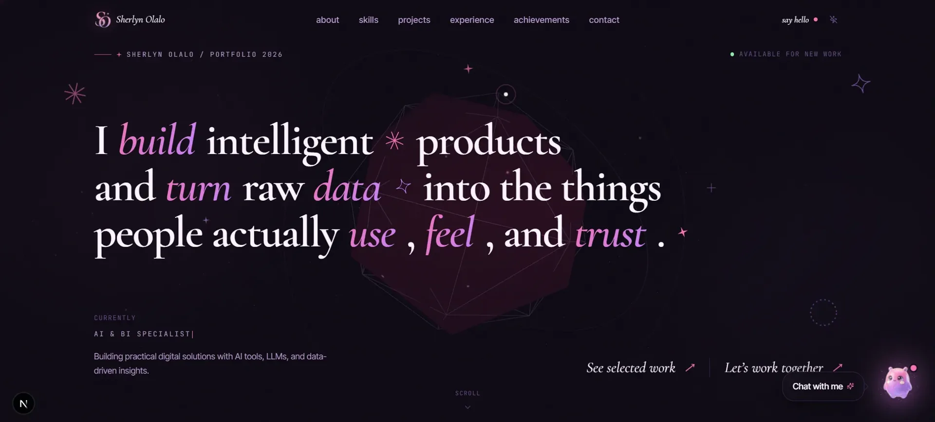
The previous build of this portfolio: a dark glass site where every project opened into its own case study, with smooth scrolling and scroll-driven motion throughout.
Year
2026
Role
Front-end Developer
Client
Personal project
Stack
Next.js 15, React 19, Tailwind CSS, GSAP (ScrollTrigger), Three.js (React Three Fiber), Lenis, Radix UI
01
The problem
I needed a place to show my work that actually felt like me, not another template. Most portfolios treat projects as small thumbnails and look more or less the same. I wanted something that felt designed, where each project gets room to breathe and moving through the site is part of the experience.
02
What I built
A portfolio with a dark, glassy feel in pink and violet. The homepage is a mosaic of project tiles, and clicking one opens a full case study with its own story. Smooth scrolling, a custom cursor and small bits of motion tie it together.
What I was deliberate about
One source of truth
Every project, finished or coming soon, lives in a single file, so the homepage and the case study pages never fall out of sync.
Motion with restraint
Smooth scroll, gentle reveals and a custom cursor add character without getting in the way of reading.
Ask, not search
A chat assistant trained on my projects answers visitor questions directly, so people can talk to the site instead of digging through it.
Next.js and React run the site, Tailwind handles styling, GSAP with ScrollTrigger drives the scroll animations, Lenis smooths the scroll, and Three.js adds the ambient 3D touches.
03
What I learned
Building for myself was harder than building for a client. With no brief, I had to decide what "done" even meant. A strong, consistent system (the colours, the type, the way things move) makes every choice after it easier, and keeping all the project data in one place saved me every time I added something new. The things this build got wrong are the reason the current one exists: case studies with no images, a prefetch storm on load, and reveal animations that could blank the viewport.